Leadership tips
Good slide decks
How to make slides engaging

Quinn Daley they/them or she/her
Technical leadership consultant
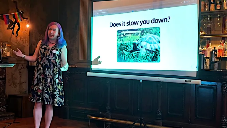
Last week I spoke at Queer in Tech Leeds, and my talk Fun is mandatory was last week’s blog post.
So I thought this is a perfect time to talk about slides. This isn’t exactly a “presentation skills” blog post (although let me know if you want to read one of those!) but a post specifically about the visual accompaniment that inevitably comes with public-speaking in a workplace setting.
How often have you been to a talk and the presentation has including slides with dense text or diagrams that you couldn’t possibly read, and just looking at them gave you a headache?
How often have you been to a talk and the speaker has tried to do it using only one long monologue with zero-to-one actual slides behind them?
Have you been either of those people? Read on!
Why visual aids are important
Many times I’ve seen people saying they “prefer to have a conversation” and then basically refused the idea of a slide deck altogether, opting only for speaking with no visual cues at all. Or they might have a title slide and leave that title up for the whole presentation.
Not having slides is an accessibility issue! Especially for neurodivergent people. I’m autistic and my flavour of autism means I process all information through the visual part of my brain. That means it’s very hard for me to understand audio-only talks, such as podcasts. Have you ever noticed neurodivergent people putting the subtitles on the TV even though they have typical hearing? This is the same thing.
Having a visual cue that changes while you’re speaking is really important for people who are using the visual information to break the talk down into chunks. It serves the same purpose as headings or aside panels in an article.
(I remember once telling a chief executive in a meeting of 200+ people that they could “just have a picture of a duck” behind them and it would solve my problem, as long as it changed into a different duck every time the topic changed.)
The best slides
In my opinion, the very best slides contain just the following elements:
- A title introducing the current topic or sub-topic
- A large image containing little-to-no text
Here’s an example from my “Fun is mandatory” presentation:
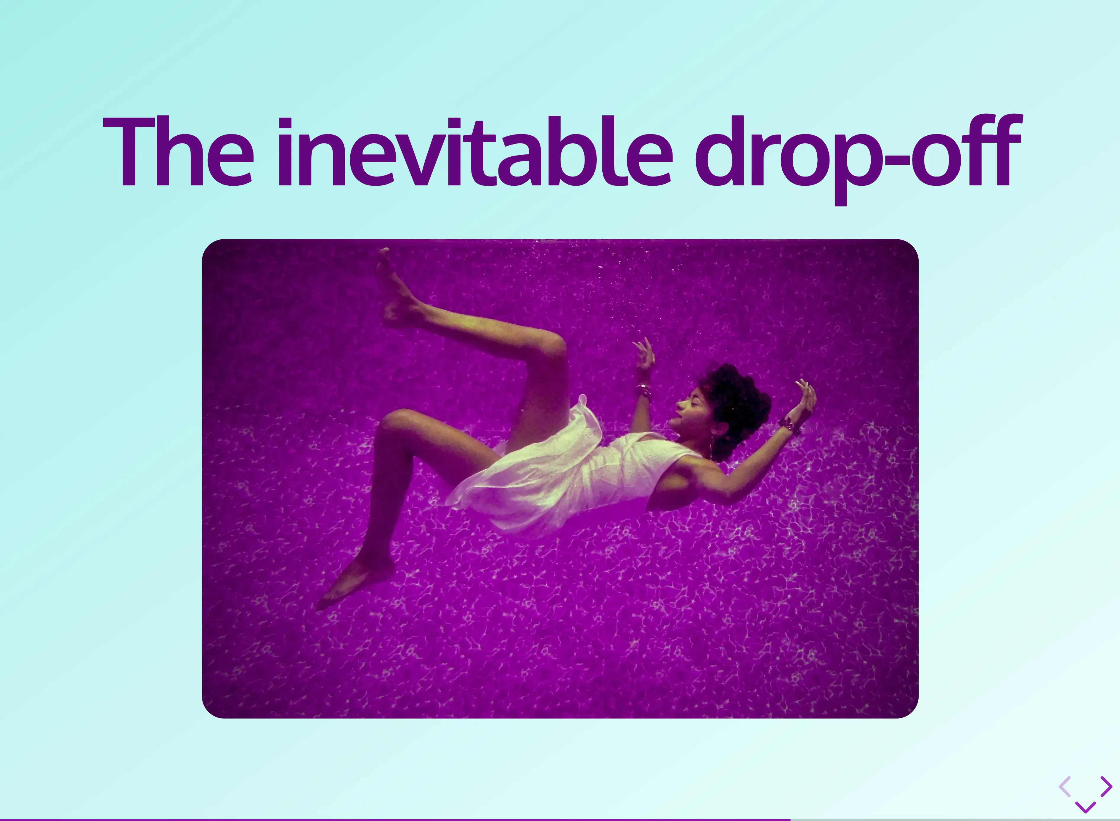
If your topic is broken down into lots of smaller topics, there’s probably a temptation to list these on your slide as bullet points or an infographic. But often these can actually be a slide each.
We don’t have to be conservative with the number of slides - more slides doesn’t mean a longer or more dense talk, it just means spreading your content out and giving it space to breathe visually.
Speaker notes
But if your slide is just a topic and picture, how will you remember what to say?
I think this question is often the source of the anxiety that leads to “put all the text on the slide”. If the text is on the slide, then the speaker feels more at ease because they don’t have to memorize loads of complicated words.
If the text on the slide is there for that reason, then the slide is for the speaker, not the audience.
Most presentation tech, including PowerPoint, Google Slides and the tech I’m about to introduce you to, have a speaker notes field. This is the place to put the words you need to remember during your presentation.
Most of the time, when you are presenting you will have two screens - the projector screen, and the screen of the computer powering the presentation. And all presentation tech has a way to run in dual-screen mode. If you do this, the main screen will have just the slide, and the laptop screen will show the slide alongside your speaker notes.
Anxiety: cured. Boring wall of text on slide: gone. Visual aid: restored.
How to pick images
Another common challenge I hear is that the topic isn’t a very visual topic and there aren’t any suitable images.
The truth is that what image is “suitable” is very much in the eye of the beholder. My usual approach when I don’t have an obvious illustration is to go to a royalty-free image library such as:
and just type in one or two words from the topic I want to illustrate, then pick an image from the first page of results. Sometimes this creates a bizarre or extremely tenuous link to the topic. For example, in my recent talk I had a slide with the title “Just chat”. The picture was… a cat. (“Chat” is also the French word for “cat”.)
When picking images, don’t get too hung up on what they are: remember “it could be a picture of a duck”. People can form memories better when they have an image to attach your words to, but it doesn’t really matter what the image is.
When bullet points are needed
I think “title and large image” is the gold standard for slides, but sometimes you do need bullet points, and you shouldn’t be afraid of using them when it makes sense to do so.
Examples of times when it’s good to have bullets on a slide include:
- When you need to spell out names that are not obvious in speech only - this is especially true if you’re talking about people.
- When you’re repeating something you intend to say often because you want it to stick - a good example is things like your team’s mission statement or a mantra
- When you are rattling through a lot of information because the detail isn’t too important but it needs sharing for - say - people watching back on the recording. Use this one sparingly but keep it in your back pocket!
When slides are all-text, one little trick I like to do is add emoji as a visual hook. I like ⌘+C as a place to find emoji and copy them to my clipboard quickly. 🏃🏻♀️
The tech!
What tech you use doesn’t really matter that much but I find WYSIWYG editors to be very time-consuming because it’s hard to produce a consistent look and feel across slides, especially for someone who is most comfortable with CSS as a way to style things consistently.
I’m a huge fan of Reveal.js: a presentation framework that uses HTML and CSS. It also means your presentations compile to static web sites so they can be rendered in a web browser and shared easily to anyone else who has a browser.
Here’s my “fun is mandatory” presentation, built using Reveal.js - use the space bar to advance through slides, the “Esc” key for an overview, and the “s” key to open the speaker notes.
In fact, I’ve built a little Astro site builder for my Reveal.js presentations that has a number of helpful components for things like “IlluSlide” (the most common “title + illustration” slide type), “Chapter” (multiple slides that represent sub-topics) and “Notes” (speaker notes written in Markdown).
I’ve also been able to style it into Fish Percolator brand colours and fonts, but you could change it to whatever works for you - it’s just CSS.
I’ve licensed it under the Apache license, if you’d like to crib from it:
Get my Reveal.js Astro codebase on GitHub(This is what the source code for “Fun is mandatory” looks like.)
If you do use this, please let me know! I love to see my work in the wild! And I’d be happy to support if you have any trouble using it.
Remember accessibility is for everyone
Adding engaging audience-focused slides is the first step to creating accessible presentations, but it’s far from the only thing to consider when building great presentations that are accessible to everyone.
For example, consider D/deaf people who won’t be as easily able to access your presentation if it’s mostly in audio format. If you’re recording it, be sure to add captions or (at the very least) an AI transcript. But also consider making a text version as a blog post, as I did for “Fun is mandatory”.
There are lots of other things to consider when making your slides accessible, and here’s a brilliant talk by Queer in Tech co-organizer Loz Atkinson covering a great many of these… in an accessible way!
Your tips
What do you think? Do you agree with my approach to making slides engaging and accessible? What do you do differently? Get in touch to tell me! - I love any and all contact from people reading my blog, positive or constructive!
Fish Percolator is a technical leadership consultancy based in Yorkshire.
If your team is not running as smoothly as you'd like, you have long gaps between releases or bugs in production, or your people are not excited about coming to work every day... we can help!